
Previously in our blog, we published an article in which, as an introduction, we explained the mathematical basis behind PCA: Principal Component Analysis: A brief mathematical introduction.
In this second part, we will leave the theoretical part and look at a simple example. There are several programming languages with packages that include PCA. We will use Python together with the scikit-learn library.
Dataset: Iris
We will use the Iris dataset to illustrate the example. We can load the dataset from the seaborn library. We will load the libraries we will need, read the dataset and display the first five rows of the dataset to visualize what the data looks like.
import matplotlib.pyplot as plt
import seaborn as sns
import pandas as pd
import numpy as np

%matplotlib inline
iris = sns.load_dataset("iris")
iris.head()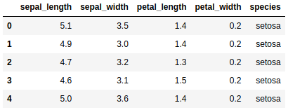
One of the requirements explained above is that the variables are correlated in order to obtain a simpler representation of the variables.
iris.corr()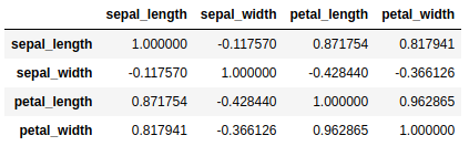
Standardization
We need the numerical variables to be standardized because there is a difference in magnitude between them. We can see that petal_width and sepal_length are in totally different magnitudes, so when calculating the principal components sepal_length is going to dominate petal_width because of the larger magnitude scale and, therefore, larger range of variance.
X = iris.loc[:, ["sepal_length", "sepal_width", "petal_length", "petal_width"]]
Y = iris.loc[:, ["species"]]

from sklearn.preprocessing import StandardScaler
scaler = StandardScaler()

X = scaler.fit_transform(X)
The sklearn.preprocessing package contains the StandarScaler class that allows us to scale our variables.
PCA
Calculation of the principal components
Once we have our numerical variables standardized, it is time to proceed with the calculation of the principal components. In this case, we are going to choose two principal components for the simple reason that this is a simple example and we want to visualize in two dimensions later.
from sklearn.decomposition import PCA
PCA = PCA(n_components=2)
components = PCA.fit_transform(X)
PCA.components_
The PCA class of the sklearn.decomposition package provides one of the ways to perform Principal Component Analysis in Python.
To see how the principal components relate to the original variables, we show the eigenvectors or loadings. We see that the first principal component gives almost equal weight to sepal_length, petal_length and petal.width, while the second principal component gives weight primarily to sepal_width.
Explained variance
In addition, we can see with the eigenvalues the variance explained by the two principal components and the cumulative explained variance.
cumVar = pd.DataFrame(np.cumsum(PCA.explained_variance_ratio_)*100,
                      columns=["cumVarPerc"])
expVar = pd.DataFrame(PCA.explained_variance_ratio_*100, columns=["VarPerc"])
pd.concat([expVar, cumVar], axis=1)\
    .rename(index={0: "PC1", 1: "PC2"})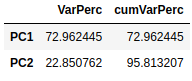
The first principal component explains 72.96% of the total variation of the original data, while the second explains 22.85%. Together, the two principal components explain about 95.81% of the total variation, which is quite high.
Visualization
In this section we are going to make two graphs for visualization: a scatter plot and a biplot.
The scatter plot is used to see the values of the observations with respect to the two principal components and to highlight the different observations by their species.
componentsDf = pd.DataFrame(data = components, columns = ['PC1', 'PC2'])
pcaDf = pd.concat([componentsDf, Y], axis=1)

plt.figure(figsize=(12, 6))
sns.scatterplot(data=pcaDf, x="PC1", y="PC2", hue="species")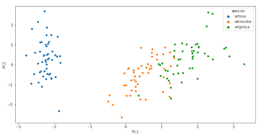
We see that there is a clear separation between the different types of species. Each flower class represents a specific cluster and the distribution can be seen in the graph.
The biplot is a graph that allows us to represent the variables of the original dataset and the transformed observations on the axes of the two principal components. The arrows represent the original variables and it is important where they point. The direction and direction indicate the weight and sign of the original variables in the two principal components.
Several things we can comment on the arrows are:
- Two arrows that have similar direction and sense indicate a positive correlation.
- Two arrows that have the same direction but different directions indicate a negative correlation.
- A right angle (90º) between two arrows indicates no correlation between them.
- A flat angle (180º) between two arrows indicates perfect negative correlation.
To calculate the biplot, we first need to define the function that will perform the plot.
def biplot(score,coeff,labels=None):
    xs = score[:,0]
    ys = score[:,1]
    n = coeff.shape[0]
    scalex = 1.0/(xs.max() - xs.min())
    scaley = 1.0/(ys.max() - ys.min())
    plt.scatter(xs * scalex,ys * scaley,s=5)
    for i in range(n):
        plt.arrow(0, 0, coeff[i,0], coeff[i,1],color = 'r',alpha = 0.5)
        if labels is None:
            plt.text(coeff[i,0]* 1.15, coeff[i,1] * 1.15, "Var"+str(i+1), color = 'green', ha = 'center', va = 'center')
        else:
            plt.text(coeff[i,0]* 1.15, coeff[i,1] * 1.15, labels[i], color = 'g', ha = 'center', va = 'center')

    plt.xlabel("PC{}".format(1))
    plt.ylabel("PC{}".format(2))
    plt.grid()
plt.figure(figsize=(12, 6))
biplot(components, np.transpose(PCA.components_), list(iris.columns))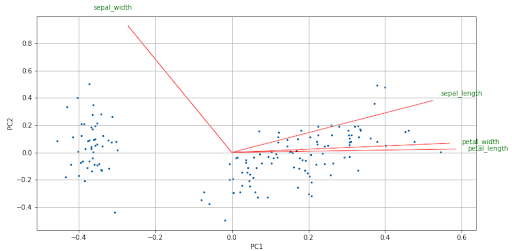
We see in the biplot the size of the arrows, it is an indication that all the original variables have some weight in the principal components.
In addition, we see that there is a positive correlation between sepal_length, petal_width and petal_length, while sepal_length and sepal_width have a small correlation since the angle formed by the two arrows is almost straight.
Between petal_length and sepal_width there is a negative correlation, in the same way as petal_width and sepal_width. The size and direction in which the arrows point indicate the weight (positive or negative) and the influence of each variable on the two principal components.
Conclusion
Along with the first post, we have been able to give an overview of the method with its mathematical explanation and then illustrate its application in Python with a simple example.
We have managed to reduce the dimensionality of our dataset and we can perform graphs, but not everything is pretty. The interpretability of the principal components is difficult, since it is a linear combination of the original variables and in general we will not know what these components indicate.
If you found this article interesting, you can visit the Algorithms category of our blog to see more posts similar to this one.
We encourage you to share this article with all your contacts. Don’t forget to mention us to let us know what you think, see you soon!
