Data visualization is the process that allows information to be represented graphically through visual resources and elements with which to understand what is happening as quickly and simply as possible.
Next, we will analyze some of the tools for representing data, the types of visualizations that exist and the importance of having an efficient data visualization.
Why is data visualization important?
In the context of a Big Data project, where a huge volume of information is handled, visualization plays a fundamental role: to present data in a way that is accessible to business decision-makers to facilitate decision-making.
Once the data has been treated and processed, dashboards are generated through different tools with which to monitor the main KPIs of the company and thus detect any pattern or trend that occurs and make decisions accordingly.
Data visualization tools
Among the most popular BI or Business Intelligence solutions used by analysts are Data Studio, Power BI, Tableau and Qlik Sense.
Although all of them share very similar functionalities and features, Power BI is perhaps the one that stands out the most in terms of usability for those who want to get started in the world of data visualization, being ideal for beginners in the use of this type of tools.
Data Studio has the advantage of being a free tool under the Google brand, but the learning curve can be somewhat more difficult compared to other platforms.
Tableau is powerful but, like Data Studio, can be more complex to use than other options such as Power BI.
Data visualization types
There are different ways of representing information depending on what you want to tell and show. In data visualization, storytelling plays a very important role, since the better the visualizations are organized, the easier it will be to interpret the results.
Thus, we can find line and bar charts, scatter diagrams, area charts, maps, tables, pie charts and rectangle charts, among others.
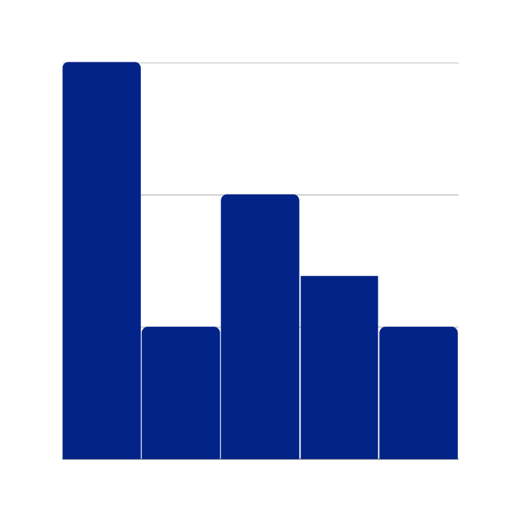
Line and Bar charts
Line or bar charts are very useful when you want to analyze trends, changes or patterns that have occurred over time. They are, therefore, especially recommended for representing comparisons between related data through time series.

Scatter plots and Bubble plots
This type of visualization is used when we want to verify the existence of correlations between different variables. With scatter diagrams and bubble charts, we can check how two metrics are related.

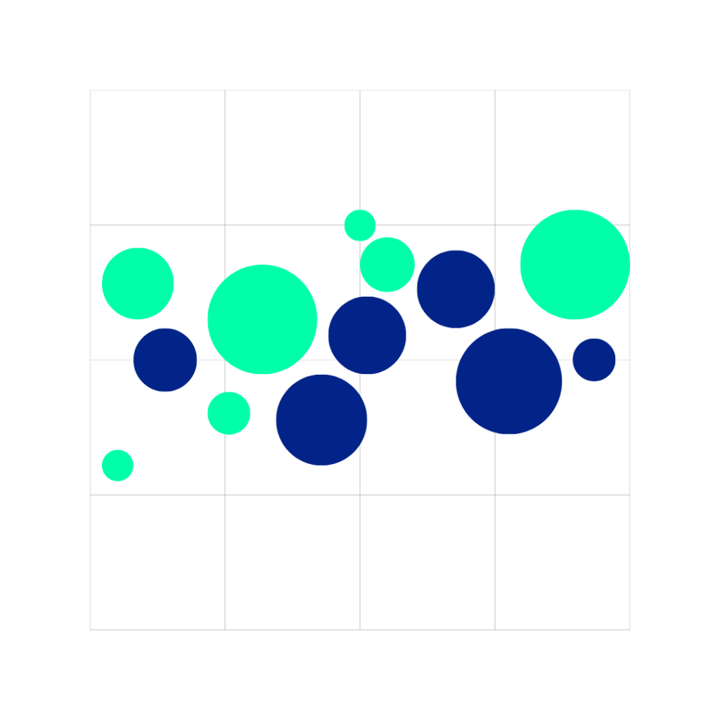
Bubble charts and scatter plots are visually very similar. They are very useful when comparing results.
Area plots
Similar to line graphs and bar charts, these visualizations are used to compare changes in various data sets over time to discover trends in the data.

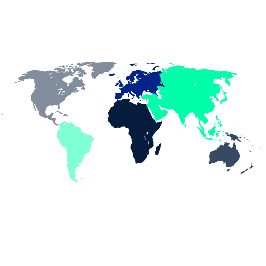
Maps
Visualization through maps is used when geographic data is available for a particular location and is very useful to understand the behavior of a dataset in a region or part of the world over a given period of time.
Tables
Tables are one of the simplest visualizations as they represent a collection of data through columns and rows to analyze and compare related values. They are recommended for comparing qualitative variables.
There is also another type of visualization known as heat maps, which are simply tables with added color shading that allows you to quickly distinguish the values highlighted in the data. Heat maps are very useful when there are a large number of records present in a table and we want to highlight maximum and minimum values.


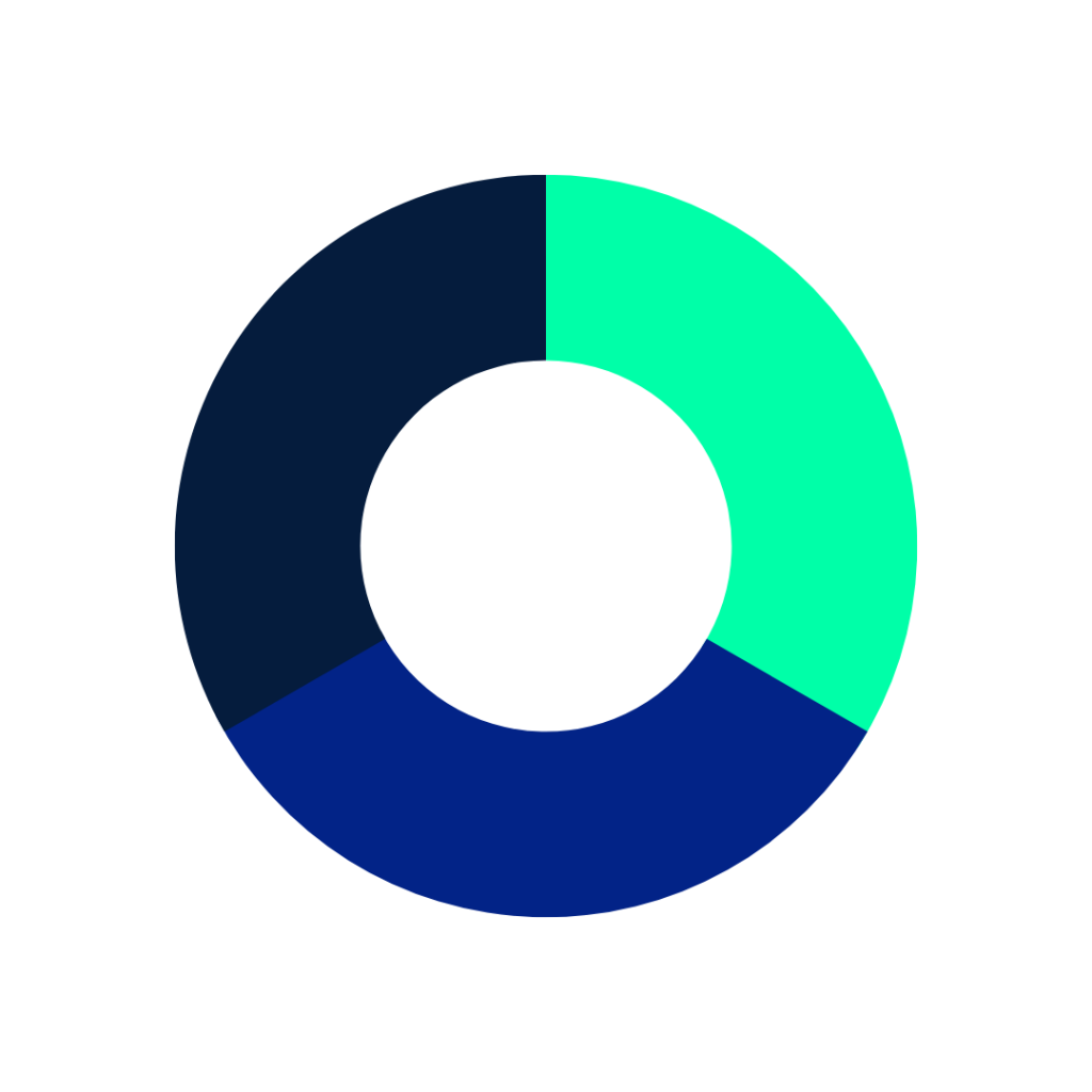
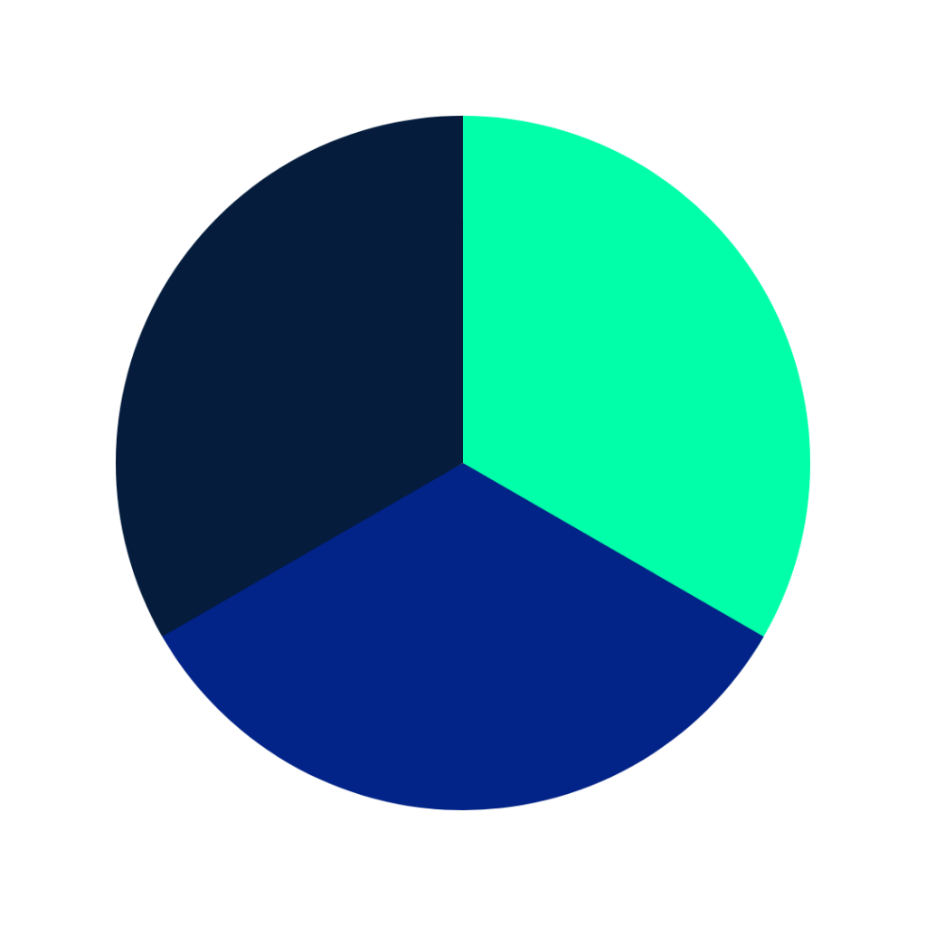
Pie charts
Pie charts are one of the most commonly used in visualization and divide the dataset into different sectors or portions that represent a percentage of the total.
Indicators
This type of graph is used to compare a current value with a target value, as well as to control and monitor progress towards the target value.

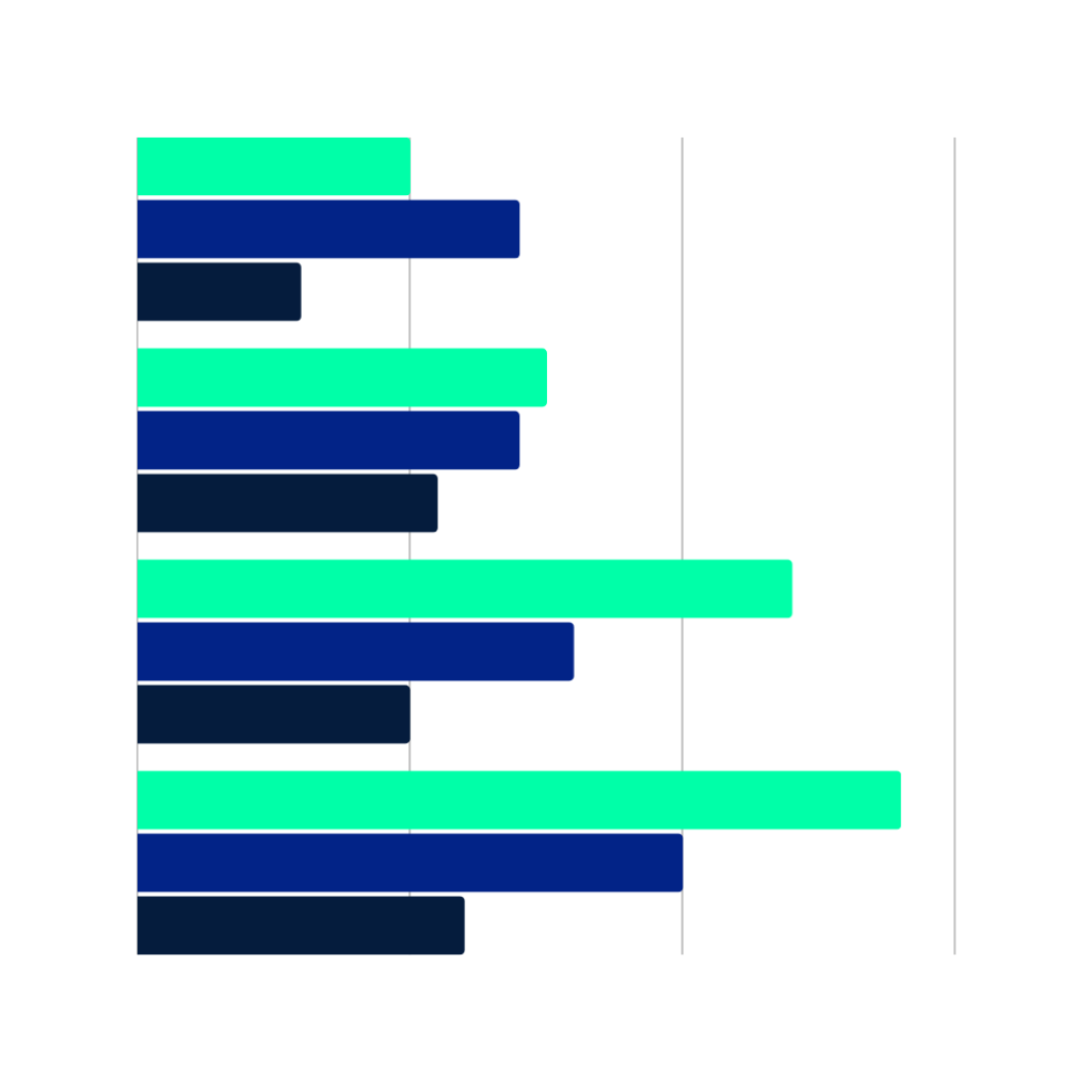
Rectangle charts
Another way of visualizing information is through rectangle charts, with which you can also compare data but in a hierarchical way, allowing you to see the trends and weights of each part of the data set very quickly.

What are the advantages of efficient data visualization?
As we have previously explained in this article, the main benefit that data visualization brings to companies is to present information in a clear and simple way with the aim of facilitating decision making for business managers.
In addition to this purpose, the creation of dashboards and scorecards makes it possible to take into account and pay more attention to small details. This means that patterns or trends that would otherwise go unnoticed can be detected more easily.
It is also worth noting that humans are visual animals, which means that our brains are able to process an image faster than text. And so it is also much easier for us to interpret the information we see represented in a graph than through a set of words or numbers.
Data Storytelling
The graphical representation of information makes it possible to better understand and explain the results obtained. At Damavis, we not only consider the importance of efficient visualization when developing projects in this area, but also the way of transmitting and capturing the message behind the data.
At this point, we must once again highlight the importance of storytelling applied to data visualization. This approach seeks to apply a communication strategy when capturing results based on the creation of a narrative through graphics and visual elements that present the data while telling its story.
Applying this strategy when creating dashboards will make it easier for anyone who is not familiar with the data to understand in a simple way what has happened.
Conclusion
The purpose of visualization is to simplify data for decision making. It is, therefore, a fundamental part of any data management process as it allows data to be transformed into dynamic and intuitive visual and graphical elements that are easy to interpret by any user.
Currently, most Big Data projects have a visualization phase that is essential for those responsible for Business Intelligence to access data quickly to speed up decision-making.
That is all! If you found this article interesting, we encourage you to visit the Data Analytics category to see all the related posts and to share it on social networks. See you soon!
