
In the world of data, several programming languages are used and one of the most famous is Python. Among the multitude of tasks it can perform, it is used to read, treat or transform data, when we need to manipulate those that we have, it incorporates libraries such as Scikit-learn to run Machine Learning algorithms and it also has other interesting libraries focused on the visualization of these data.
Surely it has happened to all of us: we want to make a chart with very specific details that fit our problem and we spend time searching over the internet. In this post we are going to explain 2 useful tips: generate multiple vertical axes for different curves in the same chart and create vertical stripes and lines to highlight x axis values.
The two most famous libraries available, and perhaps the most widely used, are Matplotlib and Seaborn. The latter is based on Matplotlib and is used to create more attractive and informative statistical graphs. Each of them allows you to make the most common graphs such as line plots, bar charts, area plots, histograms, etc. The choice of which one to use is personal, here we will use both in order to reflect the difference in syntax and the reader can see the different options.
Reading and exploring the data
We will need the two graph generation libraries mentioned above, the pandas library to read and process the data and the HostAxes and ParasiteAxes functions for the creation of the various vertical axes. Next, we import all the tools mentioned above:
import pandas as pd
import seaborn as sns
import matplotlib.pyplot as plt
from mpl_toolkits.axisartist.parasite_axes import HostAxes, ParasiteAxes
We have extracted an open dataset for our purpose which can be downloaded here. This is a basic dataset to illustrate examples like our case. We read the data into a variable and see what it looks like:
path = "Directory where the data is located"
df = pd.read_csv(path)
We have 5 fields in our table but we will keep these 4: Period, Revenue, Sales_quantity and Average_cost. There are NaN values that we will remove and we will also select only the period that includes 2017 to simplify the visualization.
df.drop("The_average_annual_payroll_of_the_region", axis=1, inplace=True)
df.dropna(inplace=True)
df.Period = pd.to_datetime(df.Period, format="%d.%m.%Y")
df = df.loc[df.Period.dt.year == 2017, :]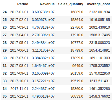
Multiple vertical axes
Sometimes, we want to represent several curves in the same graph but one or several of them are flattened because the magnitudes differ. In these cases it is very useful to incorporate a vertical axis for each curve, so that we can observe the behavior of each one in its corresponding magnitude.
If we look at the data table, we see that Revenue, Sales_quantity and Average_cost are in different magnitudes and, at the time of graphing, the curve with the smaller magnitude can be flattened. We will construct a vertical axis for each column in order to avoid the problem mentioned above.
host = fig.add_axes([0.15, 0.1, 0.65, 0.8], axes_class=HostAxes)
par1 = ParasiteAxes(host, sharex=host)
par2 = ParasiteAxes(host, sharex=host)
host.parasites.append(par1)
host.parasites.append(par2)

host.axis["right"].set_visible(False)

par1.axis["right"].set_visible(True)
par1.axis["right"].major_ticklabels.set_visible(True)
par1.axis["right"].label.set_visible(True)

par2.axis["right2"] = par2.new_fixed_axis(loc="right", offset=(60, 0))

p1, = host.plot(df.Period, df.Revenue, linestyle="--", label="Revenue")

p2, = par1.plot(df.Period, df.Sales_quantity, linestyle=":",label="Sales quantity")
p3, = par2.plot(df.Period, df.Average_cost, label="Average cost")

host.set_xlabel("Date")
host.set_ylabel("Revenue")
par1.set_ylabel("Sales Quantity")
par2.set_ylabel("Average Cost")

host.legend()

host.axis["left"].label.set_color(p1.get_color())
par1.axis["right"].label.set_color(p2.get_color())
par2.axis["right2"].label.set_color(p3.get_color())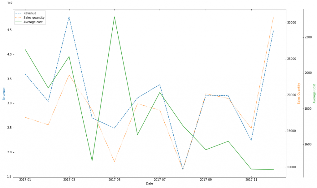
The idea is simple, we need an axis to start with, that will act as a mold (we will call it host), and we create different axes that share the x axis scale but each one has its own y axis scale. These are the functions used to create these axes:
- plt.figure() creates a new figure, we specify it to be 20 inches wide and 10 inches high with the fig_size parameter. We store it in the variable fig.
- fig.add_axes() adds an axis to the figure, with [0.15, 0.1, 0.65, 0.8] being the dimensions of the new axis and the axes_class parameter to define what type it is.
- ParasiteAxes() adds a different axis with respect to the main axis with its own y axis scale but sharing the x axis scale.
The rest of the code is very intuitive and the function names are self-explanatory.
Vertical stripes and lines
Another interesting situation is when we need to highlight a whole period or a specific date (in this example they are dates, but it depends on the magnitude of the x axis). In the first case, we will have to add a vertical band in the chart and, in the second case, it is enough to add a vertical line representing the date. To do this, we will use the seaborn library and, in this way, we see another way of graphing.
Let’s imagine that we want to highlight the entire summer period and, in addition, we want to point out Thanksgiving and Valentine’s Day to see the effect of these dates on the Revenue variable, because we sense that there may be a different behavior of revenue on these dates.
plt.figure(figsize=(20, 10))
sns.set_theme()

ax = sns.lineplot(x="Period", y="Revenue", data=df)

ax.axvline(pd.to_datetime("2017-02-14"), color="darkred", linestyle="--", label="Valentine's Day")

ax.axvline(pd.to_datetime("2017-11-23"), color="darkgoldenrod", linestyle="--", label="Thanksgiving Day")

ax.axvspan("2017-06-21", "2017-09-21",facecolor="darkgreen", edgecolor='black', hatch="x", alpha=.3, label="Summer")

ax.axvspan("2017-04-08", "2017-04-16",facecolor="darkmagenta", edgecolor='black', hatch="o", alpha=.3, label="Easter week")

ax.set_xlabel("Date")
ax.set_ylabel("Revenue")
ax.legend(loc="upper right")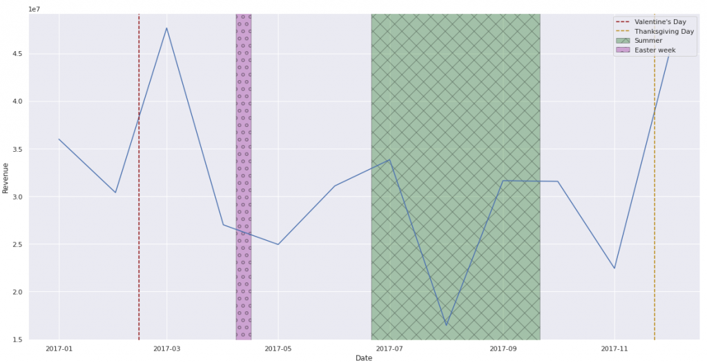
- sns.set_theme() sets the visual appearance of the graphics we make. We leave the default values.
- sns.lineplot() is the seaborn function for plotting lines.
- axvline() adds vertical lines to the plot depending on the x axis value we specify.
- axvspan() is similar to axvline() but instead of vertical lines, we specify an x axis interval and plot a strip.
The remaining code handles the x and y axes and the title of the figure. In case we want to add more than one stripe, they can be distinguished from each other by the fill (indicated by the hatch parameter, in this case we have set “x” and “o”) and not only by the color. You can also modify the style of the vertical line to identify different values of the x axis with the linestyle parameter.
Conclusion
Making graphics and dealing with all the specifications can be really frustrating, especially if we want to achieve aesthetic visualizations that contain all the aspects we want. With these 2 simple but useful tips we hope you can use them in your projects to get top-notch graphics.
Until here today’s post. If you found it interesting, we encourage you to visit the Data Analytics category to see all the related posts and to share it on networks. See you soon!
