
When there is a need to explore data or generate visualizations related to geographic entities (the polygon of a country or geographic coordinate points) it is quite reasonable to think about maps.
Sometimes it may be valid to use simpler visualizations such as bar charts or line graphs. In each case, the most appropriate graphic will depend on how much information and how accurately you want to visualize it. However, the representation of many categories in bar or line charts complicates their legibility; alternatively, representation on maps may facilitate it. In addition, when representing geographic entities on geographic maps, a certain contextual or positional dimension of the entity is implicitly included.
Normally, when we want to represent graphs for different values of a categorical variable, we tend to generate several static graphs, one for each of the existing categories. A simple and intuitive alternative can be to generate graphs that allow us to filter or select categories dynamically. Interactivity on graphs (radio buttons, animations, etc.) can be a tool that facilitates the exploration of data sets. This is especially true when there are many categories. On the other hand, map representation can include a certain degree of interactivity.
Some of the most popular visualization tools that allow interactive map rendering are Microsoft’s PowerBI, Google’s Looker and Salesforce’s Tableau. The use of any of these tools can be especially interesting in scenarios where you are already working with them and need to generate maps as part of dashboards. If the need arises in other contexts, or when greater flexibility or exportability is required, the most appropriate thing to do would be to use a dynamic graphing library. Python and R are two commonly used languages in these cases. In this post, some Python libraries are explored.
Dataset analysis
Two open datasets will be used to illustrate the use of the libraries:
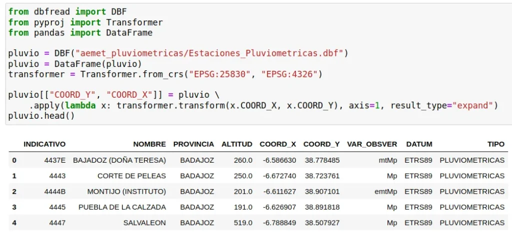
- AEMET rainfall stations location data, which will be used for the representation of coordinate points. After reading the .dbf file, it will only be necessary to convert the geographic coordinates from EPSG:25830 (synonym of ETRS89) to EPSG:4326 with Transformer from the pyproj package.
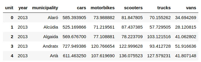
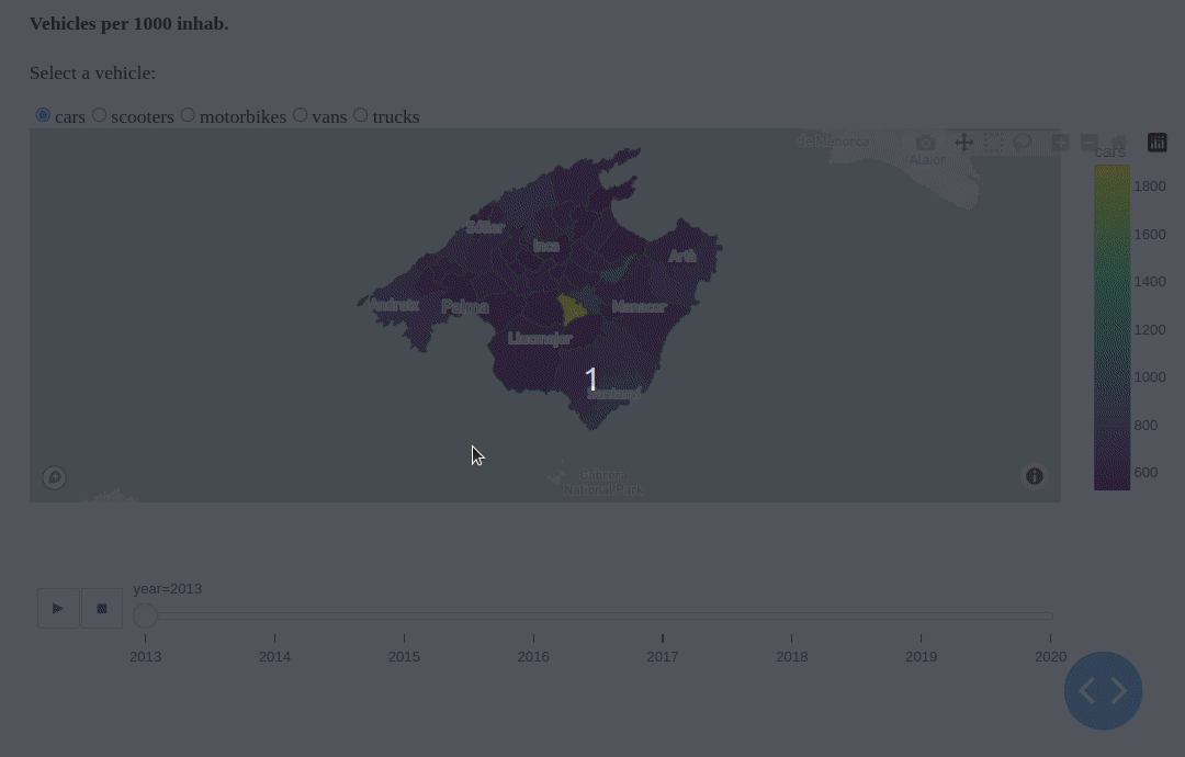
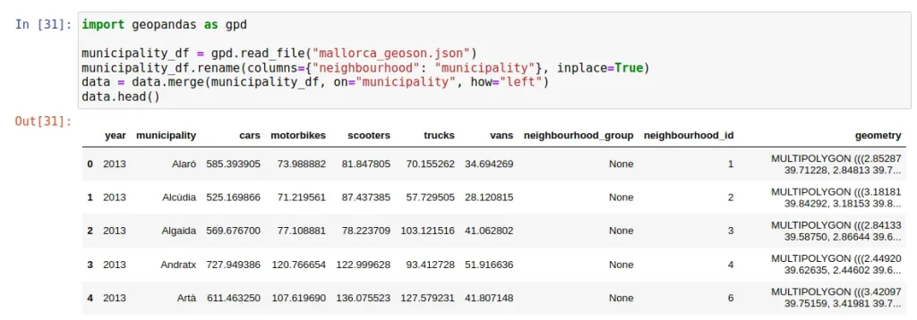
- Data from the DGT (Spanish Traffic Authority) on the vehicle fleet for the municipalities of Mallorca between 2013 and 2020. These will be used to represent municipal data. They have been aggregated and transformed to represent the number of registered vehicles per 1000 inhabitants, broken down by vehicle type. Fields have been renamed and selected to have the following structure:
When necessary, this .json (GeoJson) representation of Mallorca municipalities polygons will be used. It is important that there is a common identifier between the dataset and the GeoJson file. In the absence of this, the character string of the name of the municipalities, homogenized for both sources, has been used.
Python libraries for map visualisation
Next, we will explore how some Python libraries can be used to visualise maps interactively.
Note: Although the first version of this post dates back to 2024, we have added certain updates to keep it relevant in 2026.
How to use the Altair library
Altair is a declarative graphics visualization library based on Vega and Vega-Lite (from JS), which are based on D3.js.
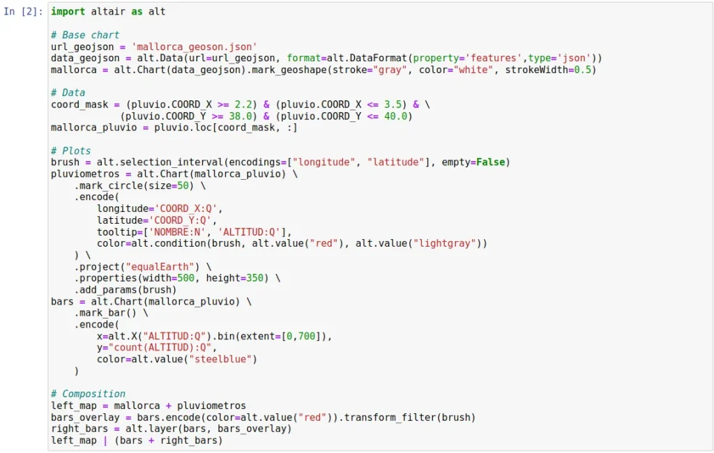
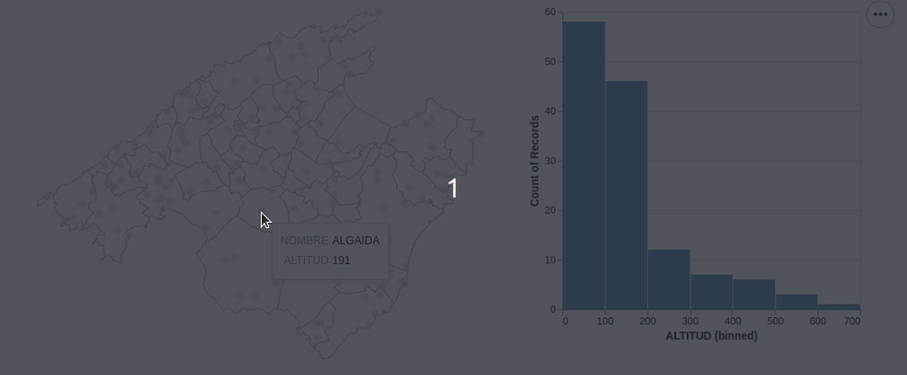
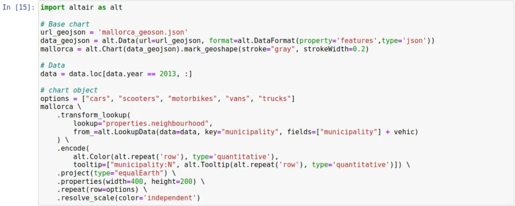
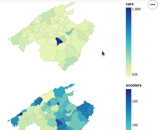
As far as the data representation on maps is concerned, it still allows a very limited variety of interactions, basically the inclusion of balloons (tooltips). Although, interestingly, it allows to associate cross maps with other types of graphics, as in the following example, adapted from the example of the official gallery of the library:
As at the date of writing this post Altair does not allow to add interactive options for filtering or category selection (or, at least, this author has not been able to find them) for the representation of the vehicle fleet, it would be necessary to generate a different map per category. For the sake of brevity, only one chart per vehicle type is generated below with 2013 data.
Altair allows exporting all kinds of charts in html format with the Chart.save() method. However, it does not save the GeoJson data of the base maps, so it seems that it is only possible to export captures in .png or .svg. It is also worth mentioning that it is compatible with some dashboarding packages such as Dash.
In addition, Altair has undergone certain significant changes at the add-on level over the years. As of 2026, this library allows access to open-access map (e.g., from Open Street) as backgrounds for mark_geoshape using the Altair Tiles add-on package.
Using Plotly for complex graphics
Another option to consider is Plotly. This is a declarative graphics visualization library based on the JavaScript library of the same name. Like Altair, this library is underneath based on D3.js, although it also takes certain elements from Stack.gl.
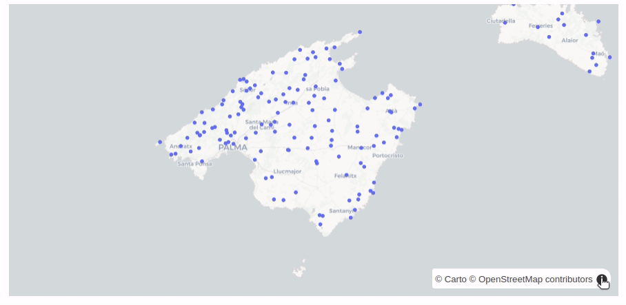
Plotly allows to represent maps with interactions similar to those offered by Altair, with integrated access to maps from Carto and OpenStreet.
# Version of the original post written in 2024
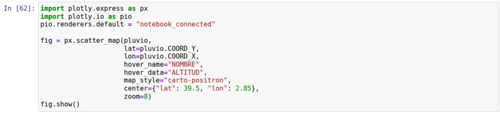
fig = px.scatter_mapbox(pluvio,
lat=pluvio.COORD_Y,
lon=pluvio.COORD_X,
hover_name="NOMBRE",
hover_data="ALTITUD",
map_style="carto-positron",
center={"lat": 39.5, "lon": 2.85},
zoom=8)
fig.show()Previously, it depended on the external Mapbox API, but this no longer exists. Therefore, to update the post, we will replace what was previously _mapbox with _map. The rest of the lines added are solely for rendering purposes.
With Plotly you can export interactive graphics, including maps:

In order to use some of the mapbox tools, it is necessary to create an account. This will give you an access token with a free tier of around 100,000 requests.
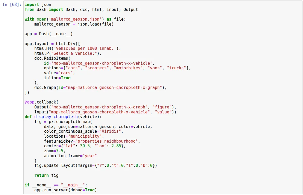
Previously, Dash has been mentioned. Dash is basically a framework for building web applications. It is based on Flask, Plotly.js and React.js, which is widely used for data visualization with Python. As a web server, Flask is a WSGI application on the backend and therefore synchronous by default. While Flask is not stateless, Dash was designed to be.
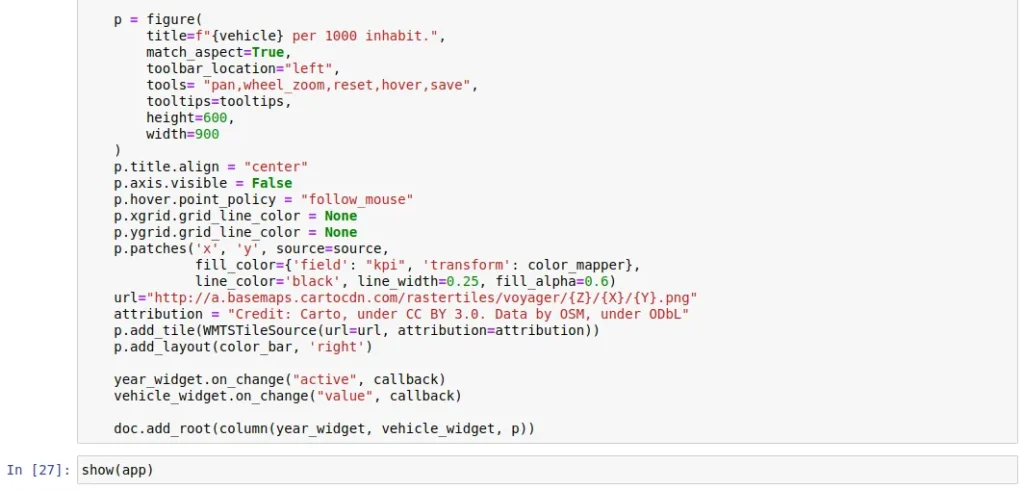
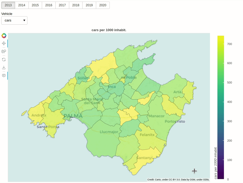
The interactive map below, integrated with Dash, includes extra interactions that allow you to explore the numbers of different vehicles over the years.
How to use Bokeh for interactive visualizations
Bokeh is a Python library for creating interactive JS visualizations that is not based on D3.js. If Plotly was integrated with Dash, which includes a Flask web server, Bokeh uses a Tornado web server, which uses WebSockets on the back end. WebSockets is stateful and asynchronous.
For the visualization of the location of the rain gauges, this time the coordinates will be transformed to UTM:
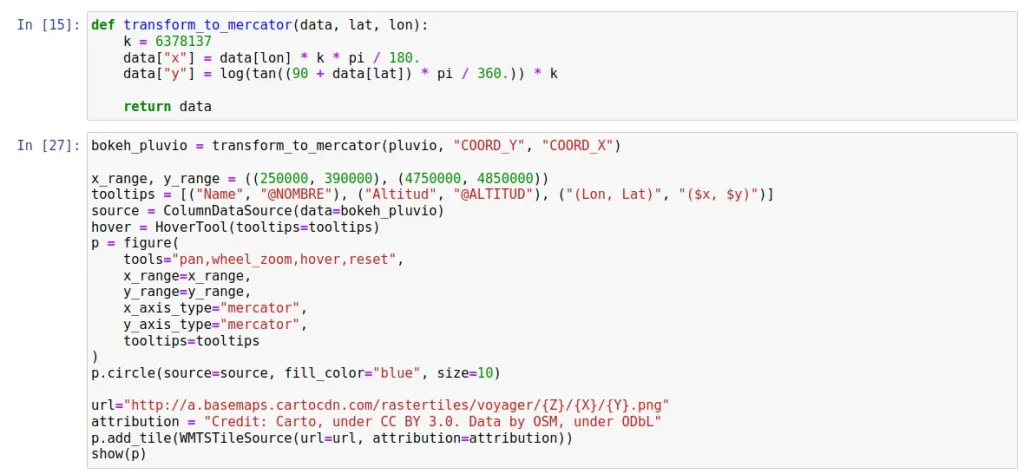
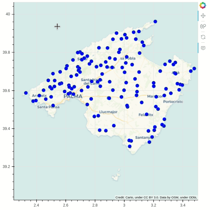
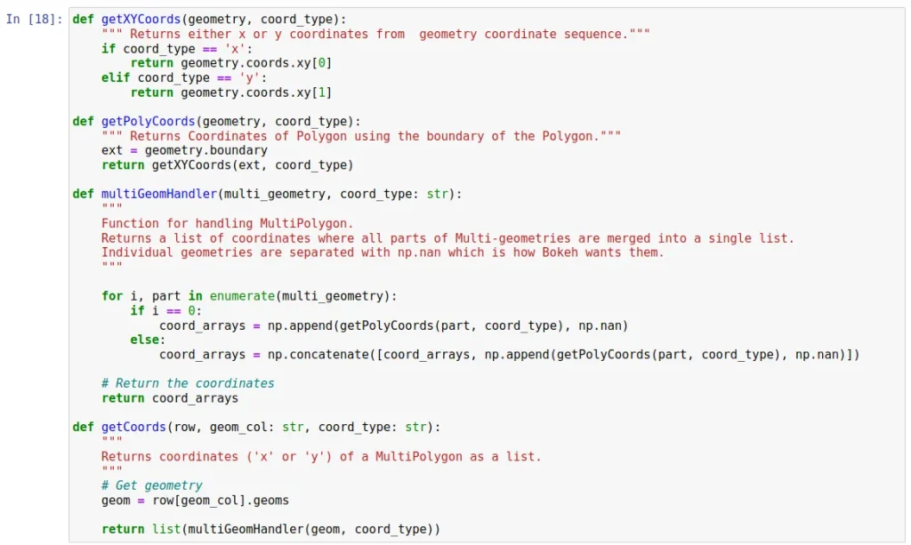
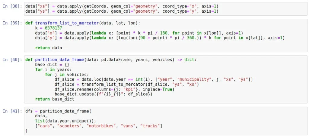
To represent the car fleet of Mallorca, it will be necessary to join the DataFrame with the GeoJson file previously transformed to GeoDataFrame. In addition, Bokeh cannot deal with MULTIPOLYGON type columns, so it is necessary to generate two columns of latitude and longitude lists, which will then be transformed to latitude and longitude in UTM system.
It is necessary to perform additional transformations on the coordinate data to represent the information. See the appendix at the end of this post for details of the preprocessing.
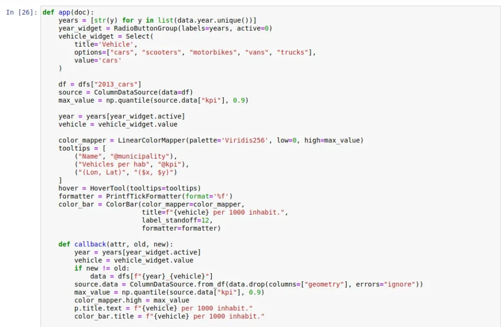
Bokeh offers different display options for your graphics:
- Using
output_notebook()generates it on the notebook itself. - You can also run
bokeh serve myfile.pyfrom the CLI to open a port to display the graph. The implementation is slightly different and other callback functions must be programmed if you intend to stream data. - It is also possible to embed them as part of a web page.
Features to consider
- Altair stands out for its simplicity, but the degree of interactivity is still very limited for maps.
- Bokeh is a bit more complex than Plotly.
- In terms of visualization aspects and interactions:
- Plotly is considered visually more appealing, with more types of visualizations and a larger community.
- Bokeh allows more flexibility in the implementation of interactions.
Web server characteristics
- For its web server features:
- Plotly integrates with Dash (stateless and synchronous) through a high-level framework.
- The web server integration with Bokeh is more tightly integrated with the library itself. Its stateful nature allows it to streamline interactions when expensive processes are required on the data, although intermediate states will require extra memory.
- In both cases the applications can be integrated with cloud technologies. For example, Plotly with AWS and Bokeh with GCP.
Data structure and volume
- Regarding the data structures they need:
- Plotly with Dash has better support for pandas, which makes it a good alternative if you want to do exploratory analysis in an agile way.
- Bokeh requires a single dataset in a
ColumnDataSourceobject, less flexible than a pandas DataFrame but potentially reusable in cross graphs interactively.
- In terms of data volume:
- Plotly and Bokeh alone can be useful for representing on maps small data sets.
- Bokeh is more agile than Plotly with larger data sets.
- Both libraries support streaming data, although interestingly there is more information on this for Bokeh.
- According to Van Der Donckt et al. (2022), Plotly and Bokeh do not scale well compared to non-interactive libraries (there is a trade-off between scalability and interactivity). For massive volumes, both Plotly and Bokeh offer integration with cudf.pandas (a Python library that emulates pandas for NVIDIA GPUs using RAPIDS environment technologies) which can help alleviate this limitation.
Conclusion
In this post, several Python libraries for interactive map rendering have been explored. As is almost always the case in data science and architecture, the optimal choice will depend on the needs of the use case.
- Altair may be an option in very simple use cases, but in most cases Plotly and Bokeh are preferable choices.
- Plotly is somewhat easier and more widespread than Bokeh, so it may represent a default choice, especially with small to medium data sets with few transformations.
- Bokeh is more flexible in the implementation of interactions and is more optimized for working with larger data sets or those requiring complex transformations.
- When the case requires it, careful consideration should be given to hosting a particular Plotly/Dash or Bokeh application on a cloud provider and assessing whether an interactive visualization will scale appropriately before implementing or deploying it.
Appendix (data transformation for Bokeh)
For the treatment of MULTIPOLYGON types, functions have been adapted from this introductory course on Geographic Information Systems with Python.
For the transformation to UTM coordinates, the transform_to_mercator function has been adapted to work on list columns. Finally, the DataFrame has been partitioned filtering by year and vehicle and the partitions have been put in a dictionary.
This is our post for today. If you found it interesting, we encourage you to visit the Data Analytics category to see all the related posts and to share it on social networks. See you soon!
